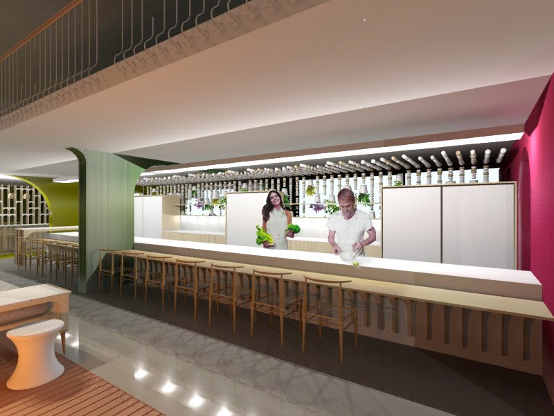
previously

Pages

7.11.10

so much to do....

sprout's walk through of the dining area is still needing work on lighting and a little bit of animation... and a sedative.

more work still to be done....

eish... photoshop photoshop, its gonna make it better... sho! 3ds max canvasses below:


16.9.10

product designs

softest soft saucerer - brass/copper lasercut sheeting, reclaimed fabric, leds - sound absorbing, mood enhancing.


display tables - reclaimed wood, plywood, bell jars - highlighting individual experience of plants on sale so that prosumerism is facilitated.


marabaraba table - wood, wood, wood - open/closing, social, interactive - indigenous african game fused with cape dutch inspired furniture.


dining set - a whole narrative is attached to this simple looking product.


3.9.10

pictures speak loudly


sometimes images explain better than what words do, which is why i put together these collage thingies to "convey the atmosphere the interior design seeks to create"...oooooooooooooooh.... i think they're lovely, though pretty simple - took ages to find just the right images...
k, back to autocad.... OH HELP ME!

28.8.10

biophilic design + spatial solidarity

just in case you thought that all interior designers do is choose cushions and curtains: examples of the conceptual development of the interior design for Stem Indigenous City Garden (my BTech treatise project)


by the way, i didn't just make up the annotations, they're the result of months of theoretical investigation...

22.8.10

can't decide

mmmm....this is what happens when i'm meant to be doing working drawings... i say no more :)

its most likely the front page of my treatise book by the way...


but im not sure if the text reads well enough...
so i made the colours a tad darker and less saturated... but now i think it loses something something warm... i cant decide ???? do i sacrifice legibility for atmosphere........hmmmmmmmmmmmmm?????


o it started out purple btw... but i dont like it.... not dirty enough...

14.8.10

grace covers pages

so...life is pretty much an amalgamation of to do lists an alarm clocks (that I sleep through). sadly to say, this whole blog thing is also one of those to do list items. i will, however, try my best to give you something that is slightly interesting.
since i am just the vainest about my work, i will show some of my pretty pretty templates for my treatise book.
the following are examples of the front and back chapter pages:


21.7.10

inspirarararararraraaaaa


thanks to http://elledecoration.co.za/2010/07/shed-new-lite/ and twitter, i found these lovely lites , of which the far most right one is the most favourite of mine. The wooden treasures are the work of Porky Hefer of Animal Farm - beyondcool names, yes?!
South African design is kwaaaaaaaaaaaai!

20.7.10

gone painting

apparently i may possibly be moving to the city of gold - jozi - when i'm all finished and kla with this whole BTech story.... yes...its a daunting thought for a little girl from little old PE. so, to calm myself down I retreated into my shoe box of acrylics and painted this:


which i think i might frame in an old, decrepit picture frame alongside this one (which i also seem to have painted):

9.6.10

!
!
!
!
!
!
portfolio 1 - done.
very much more work - ummmm not done... yet...

belows lies my most treasured works...

site:


problems and aims:


stem beliefs:


stem identity:


theory: place for sharing


theory: place for future


my favourite sketch:


you're not seeing my plans because they're so great they'll cause your mind to implode!