previously

Pages

21.5.10

logo wa wa revised


hopefully these logos are finally finalised...

stem kleur


my conceptual clothing design for stem employees...(Stem indigenous city garden - my btech interior design treatise project)

17.5.10

stand up

my exhibition stand has a special place in my heart.
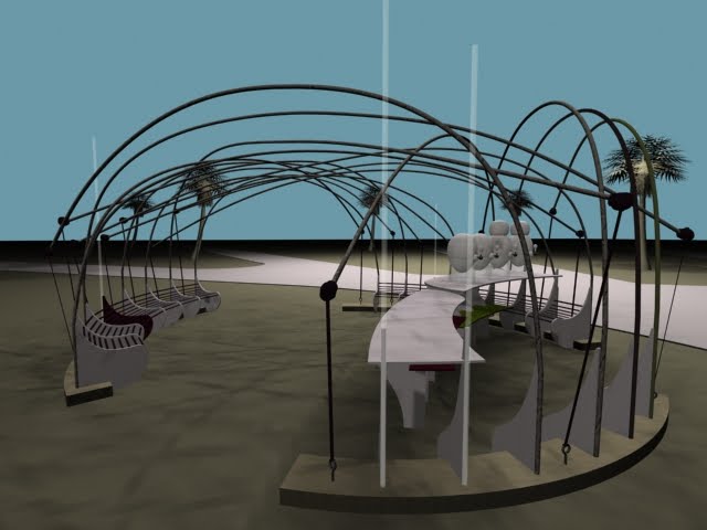
It uses shadows to define a space as interior versus exterior; it emphasizes the historical and cultural heritage of Port Elizabeth by framing a view of the good old Donkin; it reuses reclaimed industrial material (EPDM rubber) - also enhances a supple quality; it makes use of invader plants (stripped Port Jackson Willow); and it is (supposed to be) able to be dismantled and packed up easy peasy...
here are images of the model I built with my own two little hands:


here are some stills from the 3ds max avi:

for charista

feel better soon, charistatjie!

image by kevin mackintosh
http://www.oneleague.co.za/details.aspx?nav=0&modelID=489640&subID=6503&careerID=3&slideID=5264

28.4.10

who let the dog out

this is what really happened with the 3ds max scene rendering: 
original image-
my image:


told you mine wasn't as great as florian's!

24.4.10

ensoul your space

I will never understand why people think that sustainability is based on choosing the newest, most trendy, most expensive designer objects. insensitive idiots. just open your eyes and realise that if you don't love your earth, your earth won't love you - hence volcanic eruptions in Iceland and tremors in Jo'burg.


may the spirit of the earth take revenge on all those that abuse her and disregard her.
image: http://www.oneleague.co.za/details.aspx?nav=0&modelID=291383&subID=6275&careerID=3&slideID=5264
photo by Antonia Steyn

simplicity

STOP MAKING EVERYTHING SO COMPLICATED!

again, thankyou oneleague for your wealth of inspiring images: http://www.oneleague.co.za/details.aspx?nav=0&modelID=291383&careerID=3&slideID=5264

3ds max rendering

this is the result of all my very hard work on 3ds max - theeee most difficult 3d program to operate ......ever!

I'm not even going to bother putting in the original image because it looks identical because...... this is the work of a professional 3ds max illustrator - Florian Stephens... mine doesn't look nearly as good as this... boooooo...

image found at: http://florianstephens.com/2008/10/17/interior-3d-renders/samantha_jpg_72_dpi1/

liewe lulu

Lulu is probably my most favourite cafe design by most favourite interior design team - Tonic.

I'm not going to give you an entire analysis on the space, because I doubt anyone has the energy or motivation to read so much unless they really have to, but I guess I should atleast explain why I like the interior design:
1. the subtle reference to South African farm culture - as though Lulu is this really quirky cool boeremeisie from some dusty little town in the vrystaat that eloped with an equally cool and quirky rich artist from Cape Town (obviously) and then decided to just let arty stylish strangers come into her house to chill for lunch everyday. ie - coziness + sense of place.
2. the custom designed furniture (in my imagination made by lulu and the artist in their loft studio in kalk bay or something) that is beautifully construncted with just enough detail to make it special - but not overly decorated.
3. "brick" shaped glazed ceramic tiles in off-white-cream and exposed wood (teak?) trusses.
4. pinky cherry strawberry red versus cream.

images: http://www.tonicdesign.co.za/list.php?row=7&cat=4

more reclaimed wood

this is super amazing - please will someone get this for me for my birthday - 15 june, guys, dont forget.
1: cute side table - very subtle, yet styyyyyylish

2: okay... coffee table redistributed into a cluster of wooden arrangements... not quite functional - but fun especially if you have a home that is frequented by children - or if you're really bored with lots of free time on your hands (ie. not an interior design student).
3. hah ahaahaaa! and this is what happens when you are an interior design student that has by some miracle managed to find some free time to do things that are "not interior design related".

4. and this what happens if you're a teaching/bcom/ba/etcetcetcetc/anything other than interior design student...

thanyou michelle kaufmann for your very smart design created from reclaimed wood for your friend's baby boy. hosh!
see more at http://blog.michellekaufmann.com/?p=2341

pio-pio pow pow

You see, dear sweet Lampenhof (documented in a previous blog) has an abundance built in solid wood partitioning and cabinetry - which has sent me in the direction of reclaimed wood for use in the interior design .This restaurant by Sebastian Mariscal Studio shows the authenticity, honesty and history that can be inscribed into an interior space through the reuse of this natural material.

i very much approve the design's simplicity and juxtaposition of warm natural wood and cool raw manmade concrete - though concrete is terribly unsustainable.
the brass accent wall's provide some serious wow-factor. tres bien Sebastian. this place has got staying power - less waste, more longevity.

info reterieved from: http://deluxearch.com/natural-design-of-pio-pio-restaurant-by-sebastian-mariscal-studio#more-1593

26.3.10


image: photograph by medecina rosa


Lefebvre, H. 1991. The Production of space. (Tr. Nicholson-Smith, D.) Oxford: Blackwell Publishers.

P95 
"Let everyone look at the space around them. What do they see? Do they see time? They live time, after all; they are in time. Yet all anyone sees is movement. In nature, time is apprehended within space – in the very heart of space: the hour of the day, the season, the elevation of the sun above the horizon, the position of the moon and stars in the heavens, the cold and the heat, the age of each natural being.
Until nature became localized in underdevelopment, each place showed its age, like a tree trunk, bore the mark of the years it had taken it to grow. Time was thus inscribed in space...". 

logo wa wa

these are what I have decided upon for the logos of and indigenous city farm brand:
stem is the place as a whole, but also the signature lifestyle retail portion

sprout is the restaurant

sow is the garden farms/ greenhouses.


is it a terribly bad thing that it resembles something very art nouveau-ish? i mean art nouveau was very much about organic curvilinear lines that allude to nature, and so are theses logos.... hmmm.... i think it's fine, especially since the end result of the interior design won't be a art nouveau revival.

do you think they work?


5.3.10

stop

“It is so difficult to talk about buildings in terms of what they really are socially, that it is eventually easier to talk about appearances and styles and to try to manufacture a socially relevant discourse out of these surface properties. This cannot be expected to succeed as a social discourse because it is not about the fundamental sociology of buildings.” (Hillier and Hanson 1984:2)
Hillier, B. and Hanson, J. 1984. The Social logic of space. Cambridge: Cambridge University Press.)

image: ross garrett at oneleague.co.za

SPCA


Mmmmmm...it looks so lovely on Computer Screen....Yes, so this is the end result of my brief, yet intensive exploration into 3d cad rendering...(if you remember, the idea is to replicate a still image of an interior environment - the post before the one before this one shows the original). But here it is again:

Its seems that in order to keep pets - a dog in this case - around, you're supposed to like feed and water and pay them attention - i wasn't really au fait with this little fact probably because i'm not exactly an "animal" person. Anyway, my dog (the fluffy white thing in the original image) ran away (either that or he got run over by a cyber bus). Yes very sad, and I take complete blame - I did indeed neglect him (or was it a her?).
PS: those towels were not downloaded!